Sunday, 16 November 2014

Calligraphy

Practicing Calligraphy 

Our task for the day was to learn how to create letterforms following the given calligraphic forms as alphabet shapes.We began by practicing copying letters from the calligraphy alphabet that we were given. It was difficult at first to get the hang of it, but eventually it became easier. When I had finished writing the alphabet, I neatened up each of the letters using a thin black pen so that they would look cleaner and more professional. Below are some experimentations with letters and writing my name. 
Once I had mastered this way of writing, I wanted to experiment further. Using the sheet, I copied a phrase written out in calligraphy, which I thought looked appealing. This type of calligraphy was slightly different as it is not all capitalised, and the letters flow more freely into one another. I preferred the appearance of this way of writing as it looked more balanced and interconnected. 
Once we had finished experimenting, our task was to create our own brand or change a brand already created, reinventing their appearance. I am from Lewisham so I thought I could try and reinvent Lewisham itself to make it become more elegant, so I reinvented the southwark council Lewisham signs that are placed all around the border of the area, welcoming people to Lewisham. I wanted it to appear more elegant and welcoming than their previous signs. I researched different calligraphic fonts to find one that I thought was appropriate and looked nice, I then copied it from the alphabet and connected each of the letters to make it look natural. Once I  had finished, I outlined it in black marker pen to neaten it up and to make it look more professional, it was also easier to use a black pen to draw in the details of the swirls and to dot the 'i'. Below is the original, unappealing, almost broken sign, and below that is my reinvention of the sign, making Lewisham appear more appealing and inviting more people in to visit. 
Our next task was to research text ideas where the text itself reflects the meaning of the word it is displaying, but only using punctuation and other letter forms. For example, the word balloon can be recreated by moving one of the 'o's further up the page to make it look like a balloon ascending into the sky, but the letter cannot be drawn on to make it look like a balloon, it is purely representational. I experimented with many words and researched other artists ideas, I then came up with the word 'fragmentation' as I thought it could be interesting to fragment the word itself. I moved the text around, and drew in pencil lines where i wanted the word to be split and moved. Although I wanted it to be fragmented, I still wanted the word to be connected so it flowed as a piece of art. Once I was happy with the pencil result, I wrote over it in pen and then removed the pencil diagonal lines. Below is the end result. 
I was happy with the end result as it freely flows across the page and is different and interesting to look at. 

The Lasercutter

Experimenting Using the Lasercutter

Our task for the day was to use an image or text, to create an interesting 3D rendering. We were shown how to create the print out on the lasercutter by finding an image, pasting it into the lasercut program and either outlining it and filling in the areas to make it simply black and white and then giving it a red outline. The black areas would be engraved and set to cut out 0.001cm to give a clear sense of light and shadow on the finished image. Once the black and white was marked out on the computer, an outline had to be placed around the image or text in red, and the red was set to cut out fully, therefore this would be the edge of the image. 

Jay Z-ring

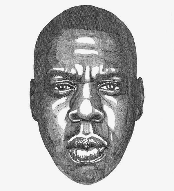
I researched some images online until I found an image I liked of Jay Z, which was a drawing (pictured below), I then searched for the original image and a posterised version, I then found one which was already in black and white therefore when pasted onto the program, I then cropped out the text as I only wanted the image of his face, and then I placed an oval shaped red outline. To make the finished product more useful, I decided to cut a small hole in the top so that it could be used as a key ring. Once I was happy with the result and the shape and size of the image, I printed it out on the lasercutter. To do this, I chose a material which I thought would work well with the design: wood, as the engraved areas would come up dark where the wood has been burnt so it would give a stronger sense of light and shadow. I then changed the print settings to natural materials and medium wood so the laser wasn't too weak or too strong that it would set the wood on fire. 
This is the posterised image that I pasted onto the program. Below is the finished result with the hole in the top so that it can be made into a key ring.

 I enjoyed this task as it was useful to learn how to use the lasercutter and the program associated with it. It will be very useful to be able to use this in the future. I was happy with the end result and I think the wood worked well with the image, it also created a very light, strong 3D image. 

Thursday, 13 November 2014

'Architectural Photography Through Time'

Designing A Book Cover

Our task for the day was to choose a subject from the list and research it and look to define and explore through text and visual means and to eventually design a book cover. I wanted to combine a few of the subjects so I chose Photography, Fine Art and Architecture at first, but after researching Architectural photography I decided to focus only on these two ideas.

Research

I then looked at a few architectural books and noticed how they explored buildings from many different time eras, I then thought it would be interesting to combine history within the book cover, so it could compare and contrast gothic, classics and renaissance style with modern. I thought the book could be laid out as a time line of architectural movements and different photography depending on the design of the building. I looked at gothic building photography from photographers such as Edmond Bacot (pictured below) and I also looked at Edouard Baldus who mostly focuses on station photography. Exploring these old photographers, I was intrigued by the effects of old photography, I was interested in the idea of the photos being in black and white only and with a slight sepia tone, this made the pictures look more aged and I wondered if the book could display modern buildings in this old photographic way to portray a more interesting and historical appearance. 
I then began to look at other works from Eduard Baldus and Louis Adolphe, who, in some of their works, reversed the colour to come out with some interesting results. 
I then experimented, combining the black and white photography with black and white acrylic paint, painted in an angular way to contrast the photography, I then introduced fluorescent orange to create a boldness. Once I had explored the gothic architecture, I looked at more modern works by Le Corbusier, Rietveld and Frank Lloyd Wright. I was especially interested in the works of Le Corbusier and his work 'Villa Savoye' as he has combined man and machine to create a balanced building that allows a car to travel underneath the building, into the garage, therefore man won't have to deal with the outside elements, it was revolutionary. The building is harmonised by the combination of counterbalancing geometric and organic shapes. He has also added pilotis around the outside of the bottom floor to add strength to the building and so nature and the building can become one, as the pilotis blend with the surrounding trees. Pictured below is the Villa Savoye. 

Typography

I then explored many different fonts to choose the right one that would draw attention to itself and also fit with the idea of a combination of eras. I decided to choose 'Hill House' as it reflects the ideals of modern day and other movements, it is also interesting to look at and draws attention to itself. 
This is the font that I chose for the front cover of my book design

The Cover

I wanted to display many pictures of different buildings from different eras, but then I simplified my ideas and came up with one. I decided to combine a traditional english victorian house with a modern, cantilevering domestic house. In photoshop, I divided each house in two, and then joined them together to create one house that reflects two different eras but it appeared to be one house. I then put the picture in black and white so that it would look more realistic and then I added a violet filter to add more colour to the cover. I then imported the photoshopped image into InDesign where I added the text and more background to match the colours of the building. I then created the blurb by researching similar ideas of books' blurbs and came up with quotes about the book. To finish it off, I added a bar code to add to the realism of the back cover. Below is the final result. 

Overall I am quite pleased with the end result, although if I were to do the task again I may have made the cover more complex as it is very simple. I am pleased with the use of colour and I very much enjoyed this task as it was interesting to look at other authors book covers and use this as inspiration for my own work, it was also interesting to explore different photography of different buildings from different eras and to compare these and explore the effects used. 

Sunday, 9 November 2014

After Effects

Using After Effects 

Our task of the day was to learn how to use after effects and to eventually make our own motion graphics 6 second video. 
We began by all making the same video for our tutorial. We imported 3 different coloured balls from photoshop, each on a different layer. Then we learnt how to make the balls descend and hit the floor, and we also learnt how to create a reflection by duplicating the object and giving it an effect so that it looked like rippling water. It was interesting to see what the program was capable of and we were able to use these ideas for our own videos we made once we had finished the tutorial.

Sunset

I decided to do something similar to the tutorial, but more interesting so I created a descending sunset over the sea. I did this by taking a picture of a sunset off the internet, photoshopping the sun and the reflection out and then I created layers on photoshop and separated the original photo so that the sun would appear to go under the horizon. So I separated the sea and the sky into different layers, and then made a sun as a third layer, and added a feathered effect to it so that it would appear to be giving off light. I then made the sun descend from off the screen, and the slow down eventually and then stop as it began to go under the horizon of the sea. I then duplicated the sun and made a reflection in the water and slightly stretched it and gave it a rippling effect to give the reflection some realism. 
I thought my video was quite successful but it was difficult to get the reflection to decrease and then disappear with the sun, so I had to make some alterations and make the sun linger on the horizon, so it wasn't as noticeable. I was quite pleased with the end result as I felt I learnt a lot about the program which I have never used before and the effects on the sun made it appear very realistic. Below is a picture of the process of making the sunset descend under the horizon and the finished result of the video.

The 33

A Film Poster

Our task of the day was to create a film poster, depicting a new film called 'the 33', which is a hypothetical film about the 33 trapped miners in Chile in 2010. The film would be full of suspense and frightening scenes, I wanted to portray the ideas of the film in the poster, without giving away the ending that they manage to get out. I wanted the ending to be a surprise, so I designed the poster showing the suspense and people trapped in the mine on one side, and worried people praying on the other side, to show the desperation and fear from the miners and their loved ones.

I began by doing some research into the incident and saw many pictures from news websites depicting the men underground, but mainly the devices they were using to drill into the ground to try and save them. I decided to use a different picture of miners in my poster, as the real pictures from Chile were very low vis. I wanted to use a picture that showed how large the underground area was, and I wanted to portray them looking lost and worried, in a large mine. I used real pictures from news websites of the people outside, waiting and helping, trying to get these 33 men out. I then photoshopped 3 pictures onto one document, merging them together. The miners were on the left side and the worried people were on the right, to contrast their emotions, and to clearly show the people in daylight, and the miners in a large dark hole. Once I was happy with the photoshop document, I then made it in black and white, to make it tonally similar and so the pictures would go better with each other and I thought black and white would depict the suspense more successfully than bright colours. 

I then put the photoshop document into an InDesign document where I created the text over the top of the poster. I wrote 'The 33' in black and white to keep with the black and white theme of the poster. I decided to use a simple text so that it wouldn't draw any attention away from the pictures. I then wanted to make it look more realistic by showing a date to when it reaches cinemas. I used the same typography to write 'In cinemas in 2015' to add more interest to the poster. Below is the finished result. 

Tuesday, 4 November 2014

Illustration: 'Journey to No Imagination'

Journey into the Imagination

Our task was to create an illustrative piece of work with this title 'Journey into the Imagination'. I began by brain storming some ideas, and immediately thought of transport when I read the word 'journey', I also connected the word 'imagination' with the mind. This gave me the idea of drawing a brain, with the title across the top and maybe replacing the lines of the brain with roads, to create the appearance of a journey. I then went on to think about children's imaginations, and how this links with children's nightmares and frightening 'monsters in the closet'. I then thought I could draw a figure in a doorway, to give a scary appearance and to reflect this idea of nightmares and how our biggest fears are in our own imagination. I then looked at a 'never ending corridor' and how this reflects how our imaginations are so wide they never end, and this also connects back to the nightmare idea, and if the corridor appeared very frightening. Over the top of the corridor could be typography with the title, writing in text that reflected the scary appearance of the never ending corridor. This made me think about sleep paralysis and hypnogogic hallucinations, which I, myself suffer from. I thought it could be interesting to draw something that showed scary figures and how this is just our imagination although we are unable to do anything about it, this shows the power of our mind and our imagination. This was one of my main ideas.

Another idea I thought of began at me thinking of a city where 'imagination is banned', and I would depict a dull city scene with 'normal people' painted in grey to represent their lack of creativity. I then thought of a factory scene, where the industry is destroying the colour in the sky, this gives the idea of depression. I then thought I could draw a queue of people outside the factory, all increasing in age; at the back of the queue, painted in colour would be the babies and children, who still have a large imagination and are very creative, whereas the front of the queue would be the adults, who are forced to become dull and less creative as this is considered more 'normal'. I think it is interesting that it is more normal to see a person walking down the street hysterically crying rather than laughing or singing. Someone who is constantly smiling or laughing would be considered 'mental' or 'crazy', I think this is a sad concept. Whereas it is normal to see a baby or a child laughing or smiling, and they are able to freely be creative. This was my second main idea.

My third main idea involved the effect of music on people, this was the direct opposite to the previous idea. I thought I could portray a depressed person, painted in grey, and they plug in their music and the colours seem to grow and flow through the headphones, making the person happy and colourful. Although I rejected this idea as I thought it would be too difficult to show this much motion is a still picture. I also wanted my idea to become almost propaganda for the depressing modern day life.


Hallucinations, Nightmares and Sleep Paralysis 

I was choosing between the two ideas of nightmares and 'journey to no imagination'. I explored the nightmares idea and drew sections of the college with one figure in to show the idea of feeling alone, and scared. I then drew in another scary looking figure to show the person feeling frightened. I also drew the hand from a dementor (from harry potter) as this is very scary. I then experimented using different scary typography, I used the font from American Horror Story and Series of Unfortunate Events, to reflect the atmosphere of the picture. These sketches are pictured below.

Journey to No Imagination

I then explored the factory idea and looked at Quentin Blake's work, as I wanted the people queueing to go into the factory to look interesting (pictured below). I thought his work would work well in the picture if I painted the young children in red and yellow and happy, creative colours, and as the queue went on, and got older, I would paint the people in more muted colours and eventually in grey to convey this loss of creativity.
I then looked at the idea of propaganda, for this idea, as I wanted it to make a statement, conveying the loss of imagination, and the rejection of creative and happy people. I thought about putting a mental asylum in one corner, and making it bright colours to show that anyone still happy as an adult would be considered 'mental'. Below are some images of propaganda I found interesting, that go against the government or encourage people to do things. They also show that we are almost trapped in this world, and I want to convey a similar powerful message in my work.

The End Result

I am happy with my end result as I think it conveys the powerful message I wanted it to, and I feel I have captured the engulfing appearance of the smoke, taking over the colourful area, representing imagination. Below is my final result. I think it appears quite chaotic to convey the chaos of modern life, and it also appears quite depressing. On the bottom right, you are able to see the queue of people, walking into the factory labelled 'normality'. I felt that this task was successful as I am happy with my end result, and I feel it conveys the message I wanted it to. I enjoyed researching the illustration artists and other artists such as Dali and Max Ernst to explore the ideas they convey about the dream state and their own ideas of what we see in our dreams. 

Monday, 3 November 2014

Build

A Short Film

Our task for the week was to create a short film, in groups, based on our given word. Our given word was 'build'. We began by brain storming the word build and came up with ideas that were physically build, as well as relations that could be built. We explored the ideas of a time lapse and a life cycle, that can be built and developed. This lead onto the idea of new beginnings, building a life and a family. We then wrote a list of things you can build: Buildings, confidence, structures, character, friendships, nations, and infrastructure. We then looked at the idea of lego and machinery. 

Eventually we got to the idea of building a nest. We decided that we wanted to convey a powerful message of deforestation and the destruction of natural habitats. We thought that birds could represent nature, and we are destroying their homes by cutting down trees, leaving them homeless, and forcing them to rebuild their homes. We then did some research and I found an artist named Debra Stuckgold (her work is pictured below). 

Debra Stuckgold

In Stuckgold's statement, she says "I create mixed-media work that combines painting, drawing, printmaking and installation. Interaction with architectural structures and spatial relationships inform both my conceptual and installation processes. Many of my pieces are two-dimensional works that extend off the wall; other pieces encompass the entire exhibition space and include both sound elements and shadows. 

While I utilize diverse media, methods of presentation and subject matter to realize individual projects, the work is conceptually linked through recognition of the landscape as a receptacle of history and memory, connecting past with present. Through landscape, I address concerns that range from mortality, structural decay, to mapping and border politics." 

 Her work combines the beauty of nature and architecture and makes them one.

Habitat


We then decided we wanted to switch the concept, and allow people to see how we are destroying habitats of animals. We would do this by showing a bird in a hard hat and with a chain saw or bulldozer, destroying our own houses, and using the parts to create their own housing and supplies, allowing people to see the extent of the destruction, it puts us in their shoes.

We then played around with the sketching of the bird and how it would look. We then wanted the bird to be shown in the film clearly destroying the house in parts, so we detached the wings from the body so they could be movable. We would also make the crack in the house grow until it fell down.

At the beginning of the film, we see a beautiful scene of trees and sunlight and greenery, the next scene is dark, as all of the trees have been chopped down, and all of the animals have been forced to leave. We then played around with the idea of the bird being shown destroying the building on top of a blueprint of a bird house (which the rubble would be used to create), this was something I designed myself, looking at architectures work and measuring out the sections to create a realistic-looking design for a habitat. The main idea of the film was to create a strong message but to do so in a comical way, to make the viewer laugh, and also feel sympathetic towards the bird and make them want to change their ways.

Once finishing the film, we decided to change the name to something more appropriate: 'Habitat' to convey a more personal idea of a building.

I enjoyed this task as it was interesting to work in a group, with people I didn't know, this helped prepare me for a working environment. We also all helped contribute to the end result and I thought the process of our ideas were good and flowing, and we all took into account each others ideas, testing each of them out until we all chose a favourite together. I was pleased with our end result, as it combines realistic scenes shot ourselves, with cartoon drawings we all helped to create and design.